[Image by almariel1 under Creative Commons]
With Lionel Messi announcing his retirement from international football (hopefully he will change his mind!), and Cristiano Ronaldo’s Portugal making it to the finals of the Euro Cup, expect the usual rash of stories. Is Messi the greatest footballer of our times? Or can Ronaldo, with his equally incredible goal-scoring prolificness, lay claim to this title now?
Their legions of fans will be equally vehement with claims and counter-claims. Anecdotal evidence will be hurled at each other. Who has scored the most astonishing goals? Who has played more decisive roles in the most dramatic victories? And then, the ultimate question: who has the most outrageous talent with the ball? This is one play-off that will never see a clear winner, right?
Maybe. And then, maybe not. Take a look at this graph from an article from FiveThirtyEight.com, of the Nate Silver fame.
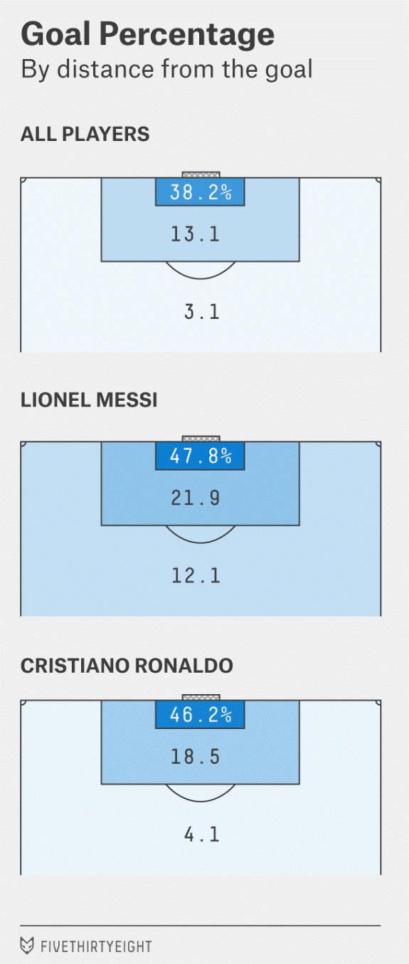
The chart couldn’t have told a more persuasive story. Messi isn’t just better; he is in a league of his own.
Magical Messi scores almost as many goals from outside the penalty area (34%) as the other top players score from inside the penalty area (38.2%). That’s just an absolutely stunning achievement. Everyone scores mostly from closer to the goal, and that’s understandable. But Messi outscores his peers from outside the penalty box as well.
In the FiveThirtyEight.com article, ‘Messi is impossible’, half-a-dozen such astounding insights comprise the argument, “Why Lionel Messi is indeed the greatest soccer player of our times.”
What’s more interesting is how the article goes about reaching that conclusion. At the outset, the key question is framed in an interesting manner (Is Messi really the best?). Then comes the part that defines what will be the relevant data (goal-scoring performance). What follows from the data crunching then is a series of rich insights, each linked to and building upon the previous one, together forming a coherent narrative.
It’s a fascinating example of data storytelling in action.
Storytelling should be an integral part of data-driven management because analyzing and generating insights isn’t going to get the job done. Those insights still need to be woven in a compelling narrative. That’s what will make the data analysis persuasive, and eventually actionable.
In business, we may not find questions as contentious as determining who is the greatest soccer player. But the problems can still be as challenging, and if we are going to rely on data to see us through, we need to find a way to create compelling stories around our data.
That’s because as human beings we connect with stories instinctively. And we need to exploit this fact to make a data-driven approach truly a part of how we work. The beauty of it is that storytelling isn’t really that tough to accomplish.
Frame an interesting problem
You could either ask: which cars are generating the maximum social media buzz? Or you could say, among the new launches in the last two months, which cars are scoring high in social media conversations?
The data work required to answer both questions is mostly going to be the same. But the second question seems intrinsically more interesting and useful. Curiosity about reactions to new cars is high among car buyers. Perceptions about older cars are already established and that information is already available.
So if data is trying to solve an intrinsically interesting problem, it will have wider appeal. And that’s especially useful in the early stages when you are trying to drive wider adoption of data-driven practices across your teams.
The framing of the problem(s) should, however, be driven by the senior team. That does not imply that functional teams have no role here. They will have questions that are more specific, and reflect the real operational/business problems. The senior team will be able to leverage their experience and use the material to formulate the question in a manner that has a wider appeal and application.
Keep the story format simple
There are only seven different types of stories in the world—overcoming the monster, rebirth, rags to riches, voyage and return, quest, tragedy and comedy. That’s it. This list covers the entire creative output ever produced by human beings. We are wired to respond well to these simple, easy-to-grasp messages.
The same idea could guide our approach to data storytelling—and for a very good reason. Data is available, cheaply and easily, across a multitude of parameters. In Google Analytics alone, you get website data across four major categories and more than 25 sub-categories. How do you create a coherent analysis from that endless data stream?
We try to think first in terms of the kind of answers we are seeking. And those generally fall into four types: trends, comparisons, correlations and rankings. Depending on the specific context you face, we decide on a type from this list first. That helps narrow down the analysis parameters considerably.
From there on, you are dealing with a manageable set of insights that the analysis is throwing at you. Connecting that to a coherent narrative becomes an easier job then.
Presentation matters, a lot
We work with a bunch of content tools, where we collate data online and then try to tag and analyze it in different ways. The dashboards our teams use can do with better presentation.
We have struggled on this front for two reasons. One, there’s this mindset within teams that the “real job” is the analysis and the rich insights you get out of that. So we don’t spend much time after that’s accomplished. Two, visualization of data is a highly skilled expertise, which isn’t so easily available. So we end up doing an average job in presentation even when we try.
But I have seen that whenever we have improved the user interface of our content tools even a bit, the gains have been non-trivial. To extract insights better, we have to be able to “see” the data better—how those tables are arranged, where the filters are put on the screen, and most of all, how neatly the query results are displayed. It’s a bunch of user interface/user experience skills that need to be brought to data analysis tools as well.
When you literally see the insights better, it becomes easier to see the patterns also better. And that gets you started on building the overall data narrative.
What we are aiming for, eventually, is a data story that is deeply engaging and persuasive. Only once that is accomplished do we start building a culture where data-driven insights naturally lead up to useful follow-up action.